I've written two articles on how I take my jewellery photographs and this blog is a supplement to them. One on the general photographic techniques needed to get the best out of small item photography and how to overcome most of the technical pitfalls people encounter and the other specifically on the lighting set up I have adopted.
I struggled for a long while with getting my photographs how I wanted, I was very much over-complicating it, because I had good gear and I felt obligated to use it. But it was unwieldy and impractical and eventually I stripped it down to absolute basics with a small digicam with a good macro mode and immediately my images both looked better and my workflow was significantly quicker and more enjoyable. I've since bought a digicam with better features specifically for my jewellery photography, I'll keep my DSLR for when that is the best tool for the job.
The lighting set up I use utilises a magnifier light I have on my work bench which has a ring fluorescent tube around a magnifier - I use it extensively for close work and it is clamped with an angle poise type frame to the end of my work bench. Whilst the light is certainly more diffuse than from a single spotlight bulb, it was still rather too harsh and unidirectional, so I made a lighting diffuser from a wild bird fat ball bucket which has two holes cut in it for camera access. I use the light on one side of it and I have the other side lined with scrunched aluminium kitchen foil. I have kept pieces of foil folded in my camera bag all my photographic life, it is an amazingly powerful yet simple tool to have in your arsenal - and can lift the light and brighten shadows more than you might expect.
When setting up some photographs today and was framing with the camera, I realised that I hadn't put my diffuser back in place after setting up the scene and as I replaced it and was looking through the camera, I was surprised to see how much it really did change the scene, so I took two photos to illustrate the difference.
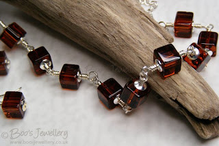 This is the scene without the diffuser in place, there are
deep shadows behind the driftwood and the scene would
need more exposure for a better result. My camera was already
set in anticipation of using the diffuser, so you can clearly see how
much advantage it offers as this image would be much too dark.
I guess that the advantage is about two thirds of a stop.
Both photographs were taken with the same, manually set, camera exposure and with the camera, light and scene exactly the same - each file was prepared to post with exactly the same workflow and settings. The only thing that changed was the placing in position of my 'bucket' diffuser. The light has been diffused by the translucent material on the right side where the light was positioned and the opposite/left side has been lifted by the light reflected back into the scene with my scrunched aluminium stuck on the inside of the bucket, opposite the light source.
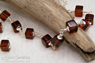 As you can see, the lighting level generally has lifted noticeably
and the deep shadows to the left of the driftwood have been
softened considerably. A bit of remaining shadow is good as it
shows more form to your pieces - diffusing the lighting too much would
actually give rise to rather flat lifeless results.
So if you're struggling with not having enough light on your scene, or deep shadows from unidirectional lighting, try scrunching some kitchen foil and then smoothing out and sticking it on some card - you can then move it around to see where you get most advantage. Using foil flat - or a mirror - will result in brighter spots of light and maybe reflections. Scrunching the foil to make it creased, then flattening it out causes it to scatter the light more evenly and will lift the lighting level generally without high spots or reflections.
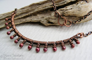
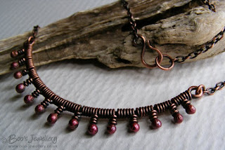
The top of this pair of shots was taken with my foil reflector and the light only, no diffuser in this instance - I was curious to see just how much difference to the lighting the reflector alone made.
I took the first frame and all I did with the second image was swing my left hand holding the reflector out of the way and take a second frame - at the same manually-set exposure - just to show how much light a small piece of kitchen foil can add to the scene - in this case, about two thirds of a stop. The top one is still a smidge under-exposed and if I wanted to use this frame, I'd tweak its appearance, including correcting the colour, a little in post-processing, but the exercise was just to illustrate the difference to the overall lighting levels in the scene and the general distribution of the light and lifting of shadows, just with the addition of some reflected light.
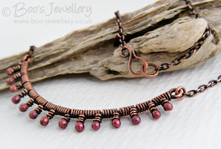
This is the finished frame I'll use, from another frame taken with a slightly better exposure and the diffuser in place too.


4 comments:
Thank you boo, your tips are really helpful. My photographs have been rather variable lately - I really need to be able to get the light levels more consistent.
Brilliant! I think you may just have solvved the problem we were having in photogaphing sword blades...
Thanks for this boo, your photos are always brilliant and I always struggle with mine! I have tagged you if you want to check out my blog :)
Thanks for the great information!
Post a Comment