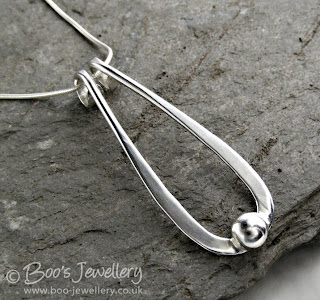
 One of my favourite backgrounds, a piece of green slate bought from the Honister slate mine in the English Lake District. I de-saturated the colour of it a little in this image as I just liked the texture against the smooth polished silver. I bought several pieces for my garden as it's a gorgeous jade colour when wet - I must remember to wet it one day when I use it.
There are many issues of concern associated with product photography - from the decision on what camera to buy to technical photography issues, lighting issues, finding the best place to work etc. etc. One subject that often comes up is that of backgrounds and 'set dressing' - how many additional props are distracting and do things look better on plain white or black backgrounds, letting the item speak for itself?
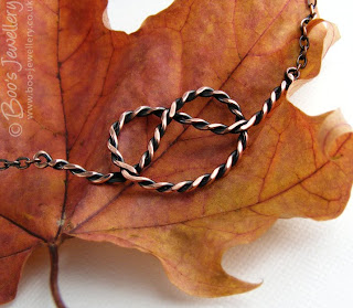 As we approach autumn and as I just love the colours, textures and shapes of fallen leaves, I wanted to use these as props in my photographs and this maple just screamed out to be teamed with some copper.
Some people recommend that all of your photographs should use the same style, setting and colour way to give a cohesive feel to your shop and establish a style that will be associated with your work, but I feel that even if my customers liked the results, I'd personally get pretty bored working on similar looking photographs week in, week out. In order to retain my own interest in the project, I enjoy thinking of ways to show a piece off, to find papers and textures to use as backgrounds and small found objects to use as props.
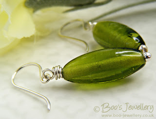 I thought these hand made glass earrings looked like spring leaves, so a light parchment base and a hint of spring blooms with a silk flower in the background enhanced that bright feeling.
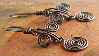 Another well used favourite - this is the bottom of a handmade earthenware pot I rescued from my grandmother's pantry - it is a lovely rich colour that can lift the pieces and has just enough texture and detail to make it interesting.
I'm personally of the opinion that a little window dressing adds to the overall attractiveness of the final photograph. You want to make an attractive image where the props and backgrounds compliment your work, hopefully without overpowering it or detracting from it. Some of my favourite objects are simply household items, often looked at from a different perspective - as above, the bottom of this pot is rather more interesting than the view you're supposed to appreciate.
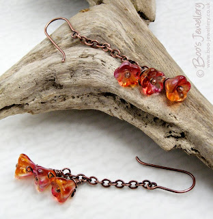 This little piece of driftwood is becoming quite the star of my photos. It's just the right size, a nice gentle colour and has lots of ridges and notches to prop work against. I found this on a lake shore after a storm - it has been smoothed by being thrown about in the water for some time. It's simply a lovely piece of natural sculpture.
I especially like textures for backgrounds - nice hand made papers, natural surfaces and colours that enhance the piece. I have amassed quite a collection of items to use. Very few of which I have paid money for. If I see a nice paper lining a box of chocolates, or wrapped around cut flowers I'll retrieve it. I have an A3 size zipped portfolio that I store all my papers in and I periodically rifle through them to use pieces I've not done so for a while, it's easy to keep working with the same backgrounds and I have to remember to refresh the look once in a while.
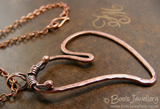 This background paper is the lining parchment from a box of very expensive chocolate truffles.
Is your background too dominant - then tone it down:
The initial tip I started this blog to pass on was a way of making your backgrounds go further - several looks from a few papers - and can also make the results more subtle where your favourite paper is a little too bold. Some time ago I bought a pack of 5 sheets of parchment paper - A4 sheets of translucent paper each with a slightly different watermark within the paper. One is marbled, another striped, my favourite has random splodges. If you place a piece of this parchment - tracing paper would work too, but would be plain - over your background paper, it immediately tones it down significantly - reducing the contrast of a pattern that might overpower your piece.
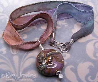 The kraft paper I used here came wrapped around some supermarket cut flowers. It is black and tan coloured and far too contrasty on its own for a background, but under some parchment, it was toned down and took on the right colours to blend with the lampwork bead and silk ribbon.
Of the 5 original sheets, I regularly use 3 of the patterns and they're always out in my photography area, slipping one over your background paper, immediately give you a whole new look. You can retain the pattern and colour cast of the paper you liked in the first instance, but it is now much more subtle in appearance.


6 comments:
Brilliant! I bought some scrapbooking paper, thinking they would make good backgrounds. After trying some I realized that most of them were actually too bold. I can't wait to try putting parchment paper over them! Thanks so much for this idea.
You have used so many beautiful backgrounds, so many good ideas, thank you. I am totally unimaginative about mine - I really need to think again.
Really great advice! Love your jewelry too, so unique.
Wonderful advise. Photography is my greatest frustration and you have given us some great tips. Thanks so much. Sally
Brilliant advice, I am always frustrated by my photography and your tips of background and props are so helpful. Love your blog and your work very inspiring!
Claire x
I must say when I first started out I tried for fabric, but sometimes wrinkles, creases, or other unwanted vantage points come up and it's a real pain. I then graduated (after asking a fellow crafter how she got such lovely backgrounds) to using scrapbook paper myself. I took care to stay towards softer and more neutral colors, so as to not overshadow the work I was trying to shoot. But I will say I was a bit dismayed when I found a print I love that was too "loud". I <3 the tip about parchment or tracing paper, I would have never thought about it and it's a rather brilliant idea!
I also agree, while I understand the penchant to suggest to people to keep their photographs of the same style, I think treating each piece in a way that exemplifies its color and display is a much better idea. It gives life to the piece rather than making it "just another photograph". :)
Post a Comment